

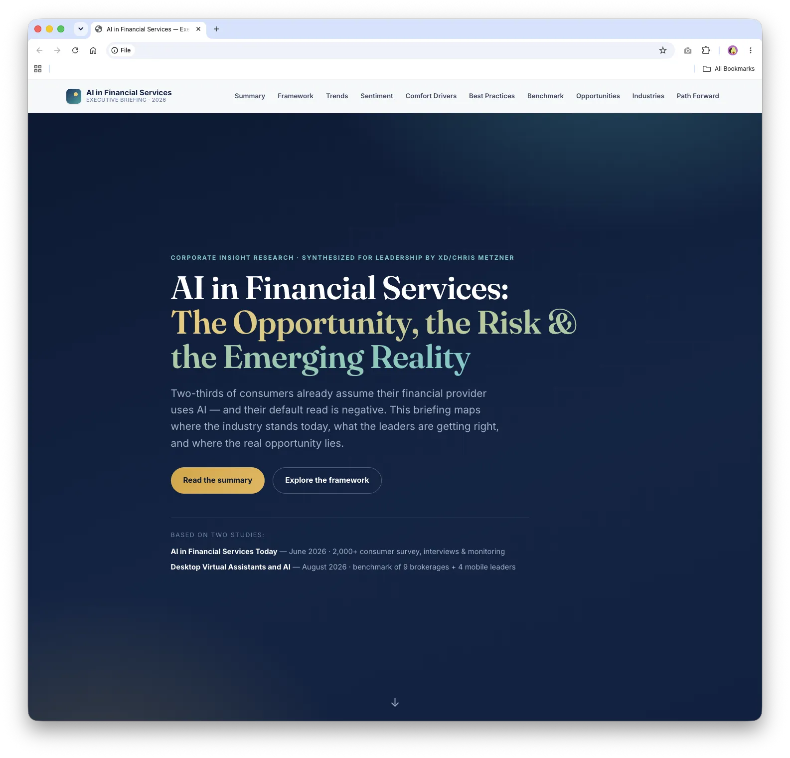
The challenge
My manager needed a presentation for the next day explaining how peer financial institutions were using AI across their websites and digital experiences. The source material was two large Corporate Insight research reports totaling more than 180 pages. That’s a big request to fit in alongside ongoing product design work.
I saw it as a chance to support my manager and to show how effectively I could lead an AI-assisted design process.
Establishing design goals
- G1 Turn dense research into a story leaders can absorb quickly
- G2 Keep every claim accurate and true to the source reports
- G3 Deliver by the next morning without pausing my Figma work
My role and approach
As lead designer, I directed the project from research synthesis to presentation design. I used Cursor with Claude Opus 5.5 to analyze the reports, find the most important themes, and turn them into a single-page executive briefing website.
The AI sped up the work, but the direction stayed human-led. I wrote detailed prompts, set the audience and the narrative, reviewed each iteration, and checked the generated content against what I had learned from reading the reports myself. That validation was the most time-consuming part of the process, and the most important.
Shaping the story
The briefing leads with a clear point of view: the gap isn’t capability, it’s trust and execution. From there, it walks leaders through the AI landscape, consumer sentiment, best-in-class examples, and a benchmark of how brokerages actually performed.
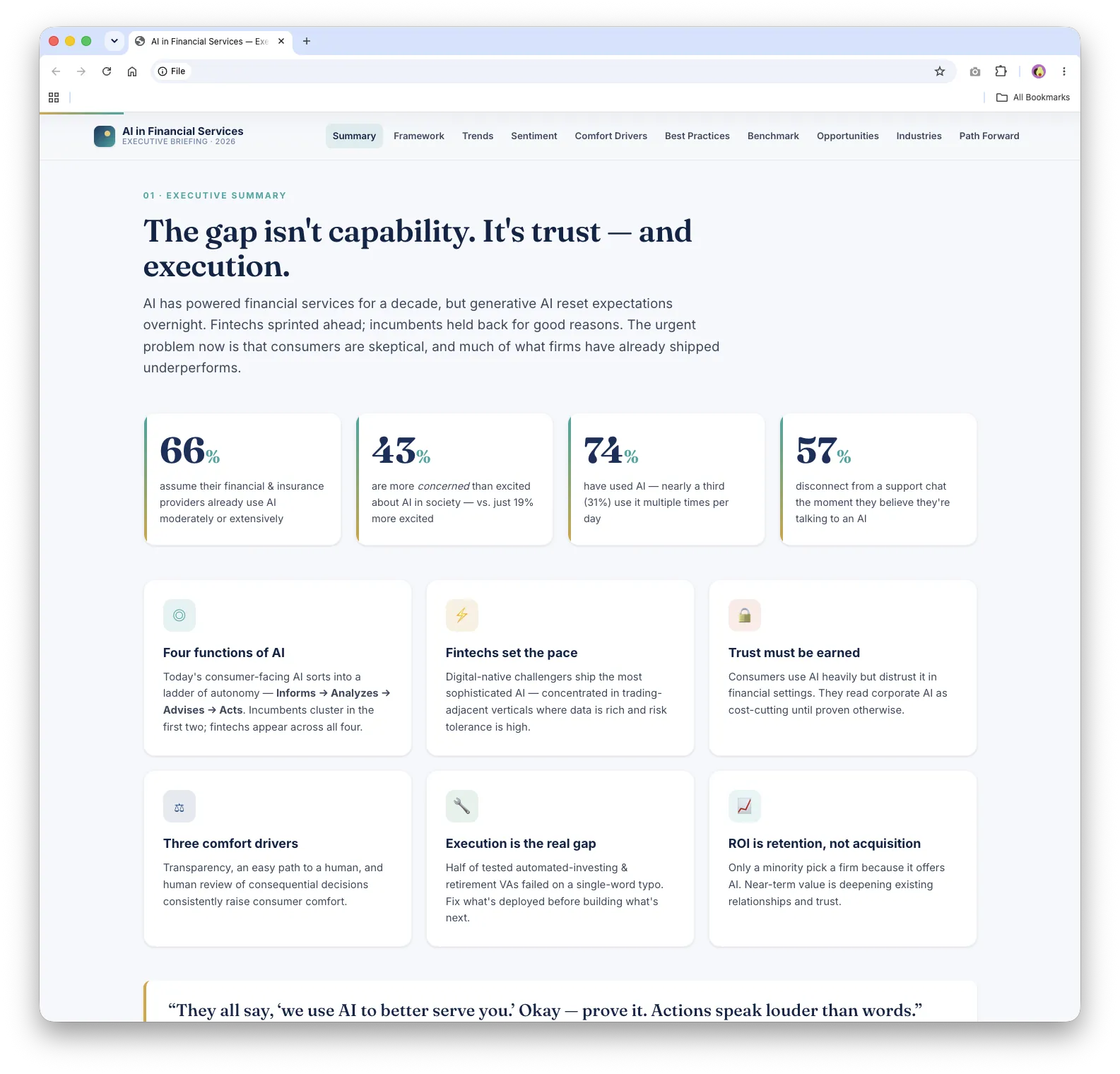
Executive summary
Four headline numbers and six key takeaways give leaders the whole story on one screen.
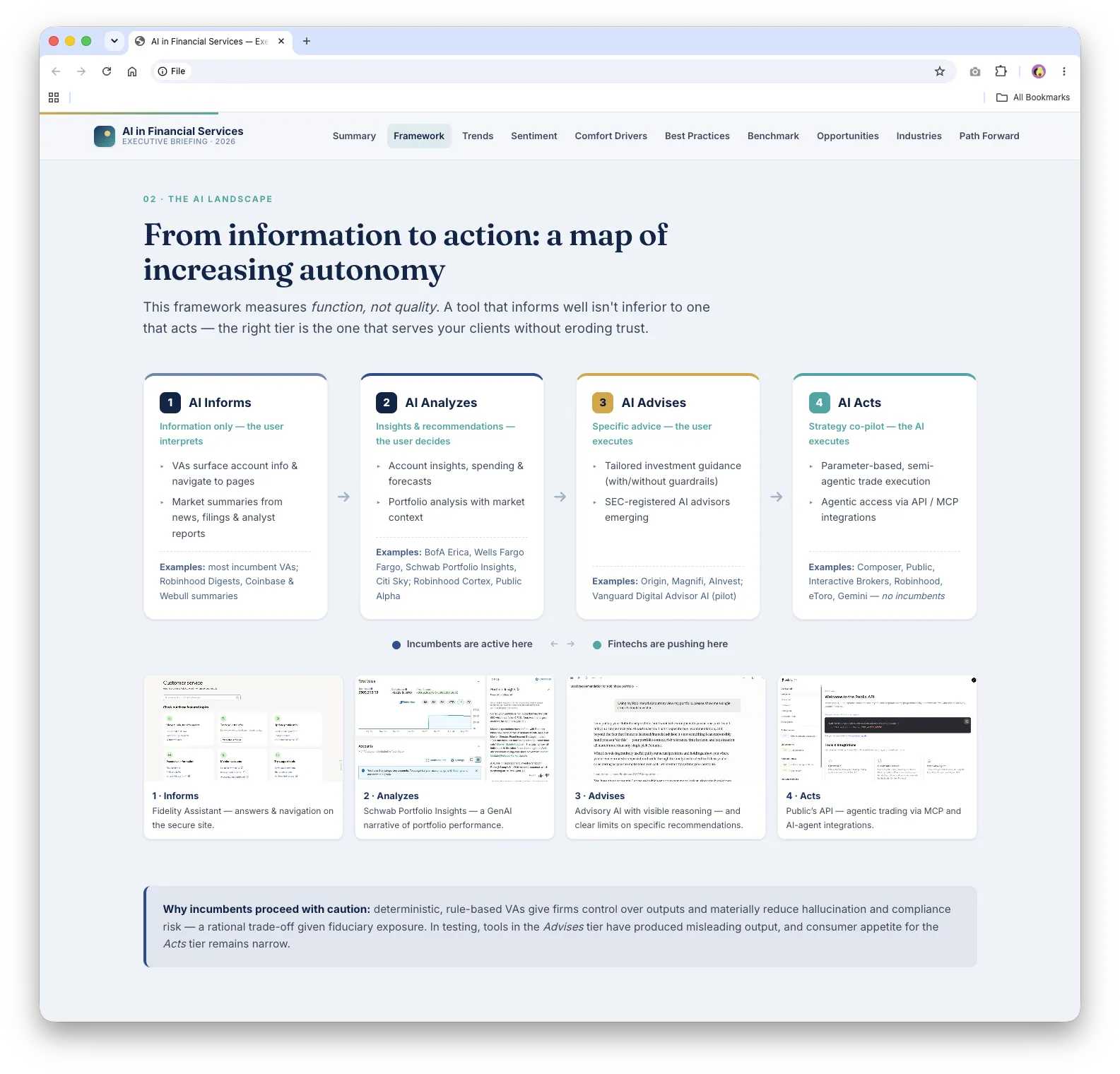
A framework for AI autonomy
A simple four-step model (AI informs, analyzes, advises, and acts) shows where traditional firms are active today and where fintechs are pushing ahead.
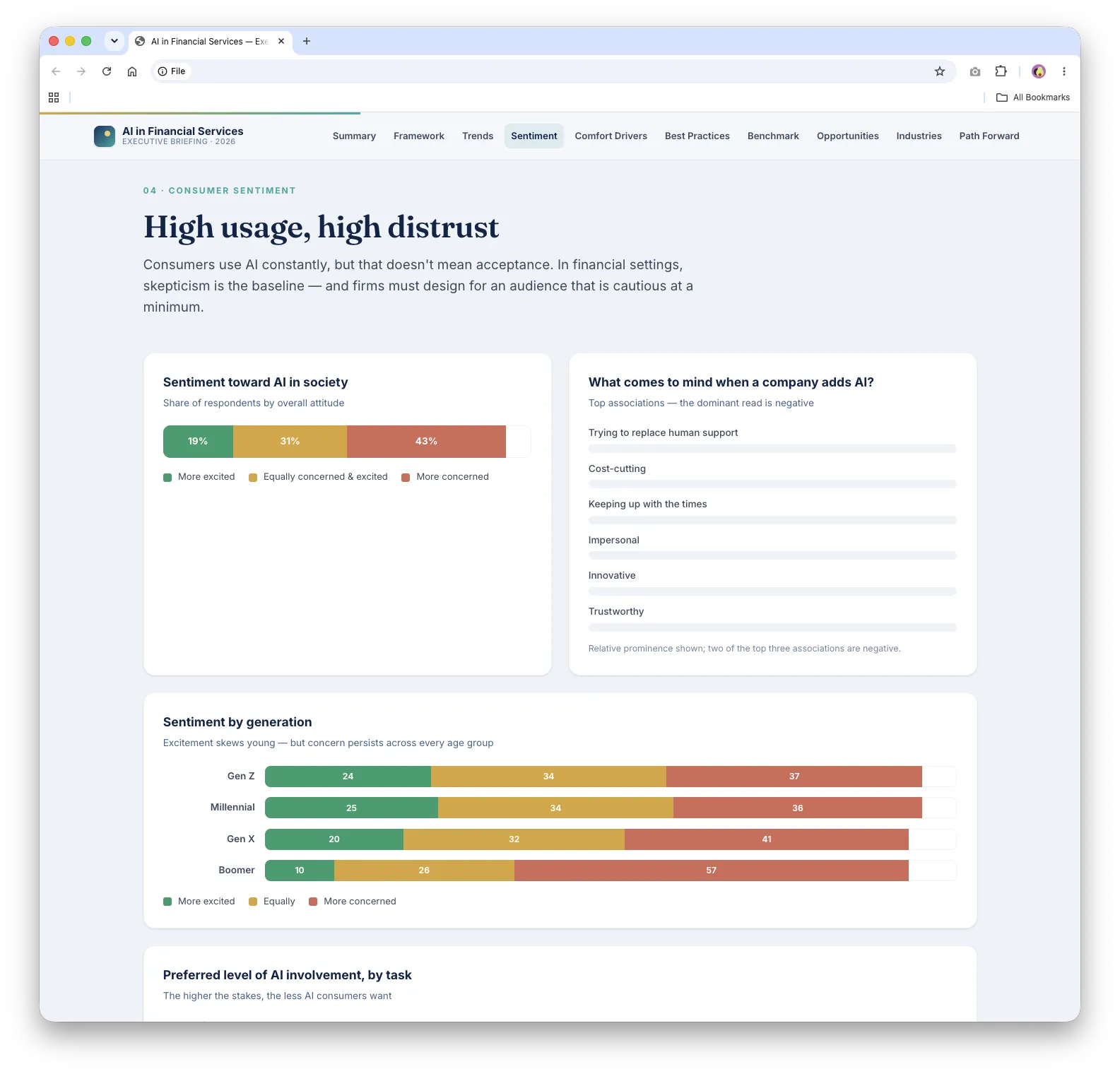
Consumer sentiment
Clear bar charts show that people use AI constantly but stay skeptical of it in financial settings, especially older generations.
Best practices and benchmark
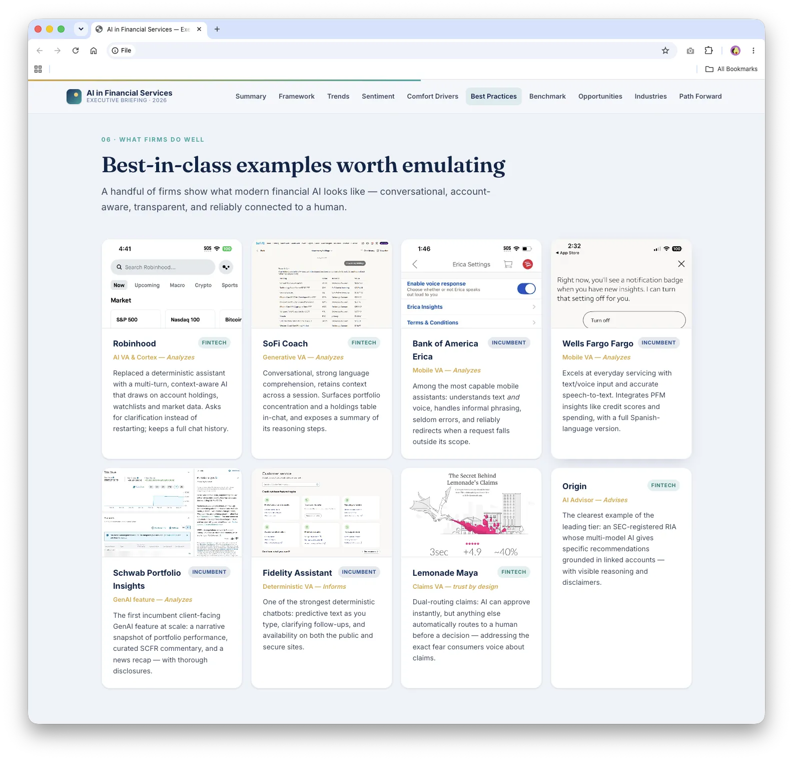
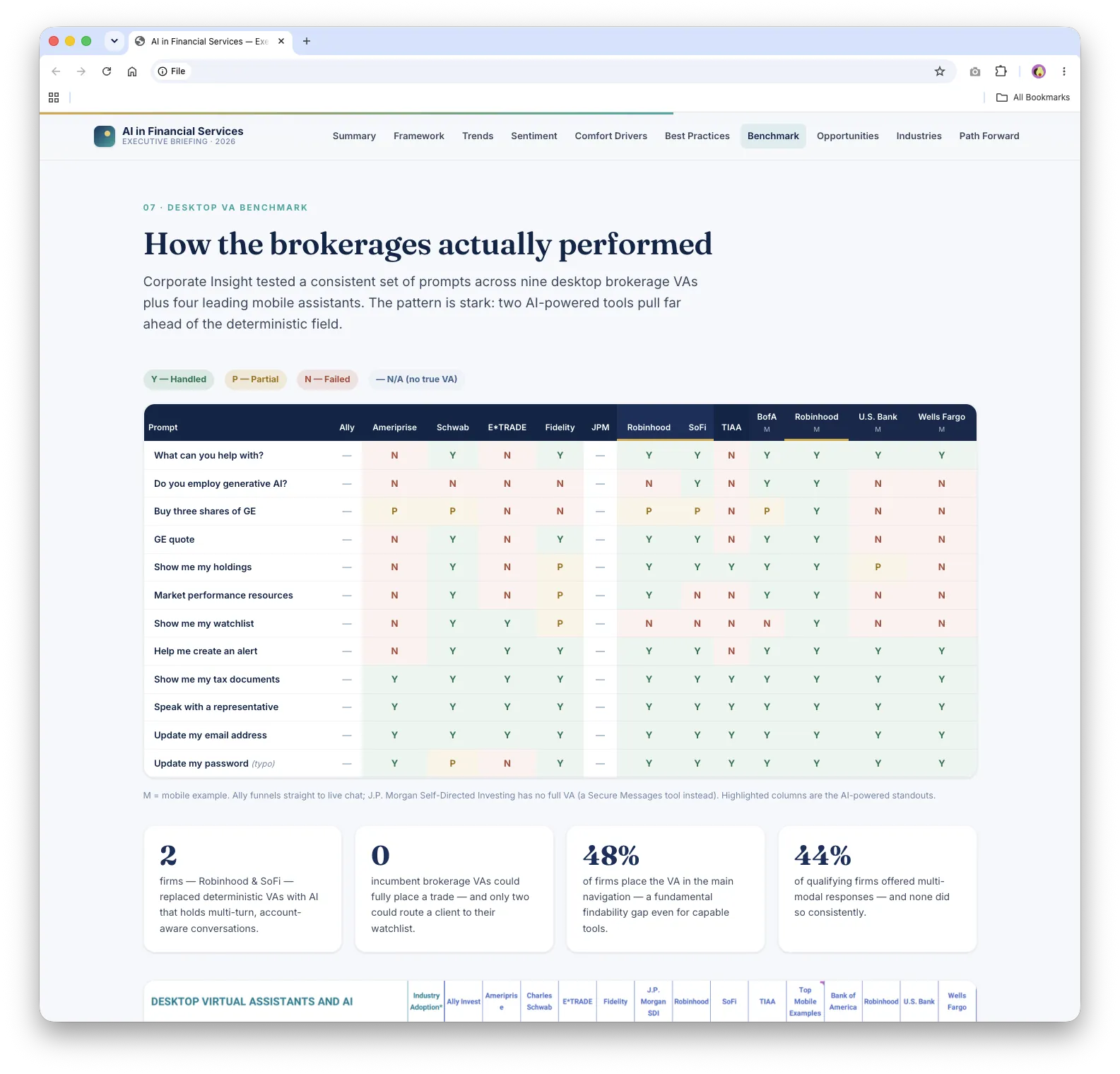
Example cards highlight what leading firms do well, and a color-coded table shows how nine brokerage virtual assistants and four mobile leaders handled the same set of requests.
Behind the scenes
The briefing is built with lightweight HTML, CSS, and JavaScript, with no build system or charting library. The data visualizations, responsive layout, animated statistics, navigation, and print-friendly version all use native web technologies.
One interesting challenge came up when the corporate network blocked a third-party PDF library. Instead of stopping, I had Cursor help me create a Python extraction tool using only the standard library. It pulled more than 200 images from the source reports, so I could bring selected examples into the presentation.
I also made small CSS adjustments by hand when that was faster and more token-efficient than prompting another round.
Outcome
The briefing was finished in about four hours and ready for my manager to use the next day. There were no formal performance metrics, but the speed of the process let me support an urgent leadership request while continuing my main Figma work for the app development team.
What I learned
This project reinforced that AI does its best work when it’s paired with clear direction, thoughtful prompts, and careful human review. Strong prompts improved both the quality of the output and token efficiency, and my own review of the research made sure the final story was accurate and appropriate for executives.
In a future version, I’d bring in more visuals from the research and keep refining the balance between detailed evidence and concise storytelling.
Explore the live work
These are the working prototypes and research sites from this project. Each one opens in a new tab.
