

Overview
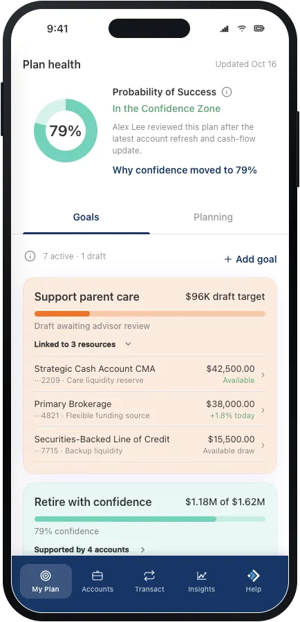
Our Business Strategy partners were preparing a product vision for future investment: a mobile app organized around each client’s financial plan instead of a list of account balances. They also wanted to add the self-directed features clients increasingly expect from peer financial apps, like trading, research, and planning tools.
It was an exciting direction, but my team’s years of research pointed to an important tension. Clients had spent years using the existing app mainly to check balances and move money. A plan-first app could offer more meaningful guidance, but it could also feel unfamiliar if it pushed those trusted habits into the background.
So we proposed a second prototype. I led Horizon App Prototype v2, a research-informed counterpart to the team’s primary, stakeholder-led concept. My goal was to honor the plan-first ambition while keeping the experience grounded in what we already knew about our clients.
The challenge
The stakeholders wanted goals to become the organizing principle of the app. Instead of opening the app just to see what they own, clients would see how their plan was progressing and what actions might help. But the evidence was consistent: clients most often came to the app for account balances and money movement.
The challenge wasn’t to pick a side. It was to build a bridge between them:
How might we make the financial plan the starting point without taking away the account access and familiar actions clients already trust?
Establishing design goals
- G1 Lead with the financial plan, as the stakeholders envisioned
- G2 Keep balances and everyday actions easy to reach
- G3 Give stakeholders a working app to react to, not just a report
My role and the team
I owned the strategy, information architecture, end-to-end experience, working prototype, and presentation of v2. The mobile IA research I had started earlier in the year is what sparked the idea for a second prototype, and it became the backbone of v2.
It was a true team effort. The lead UX designer built the primary prototype, a visual designer created the style guide shared by both concepts, and another UX designer built features, including trading, that both teams reused. Our Business Strategy stakeholders set the vision and gave feedback along the way. That shared foundation let us move fast while keeping the two prototypes visually and functionally connected.
How I worked
1. Start with evidence
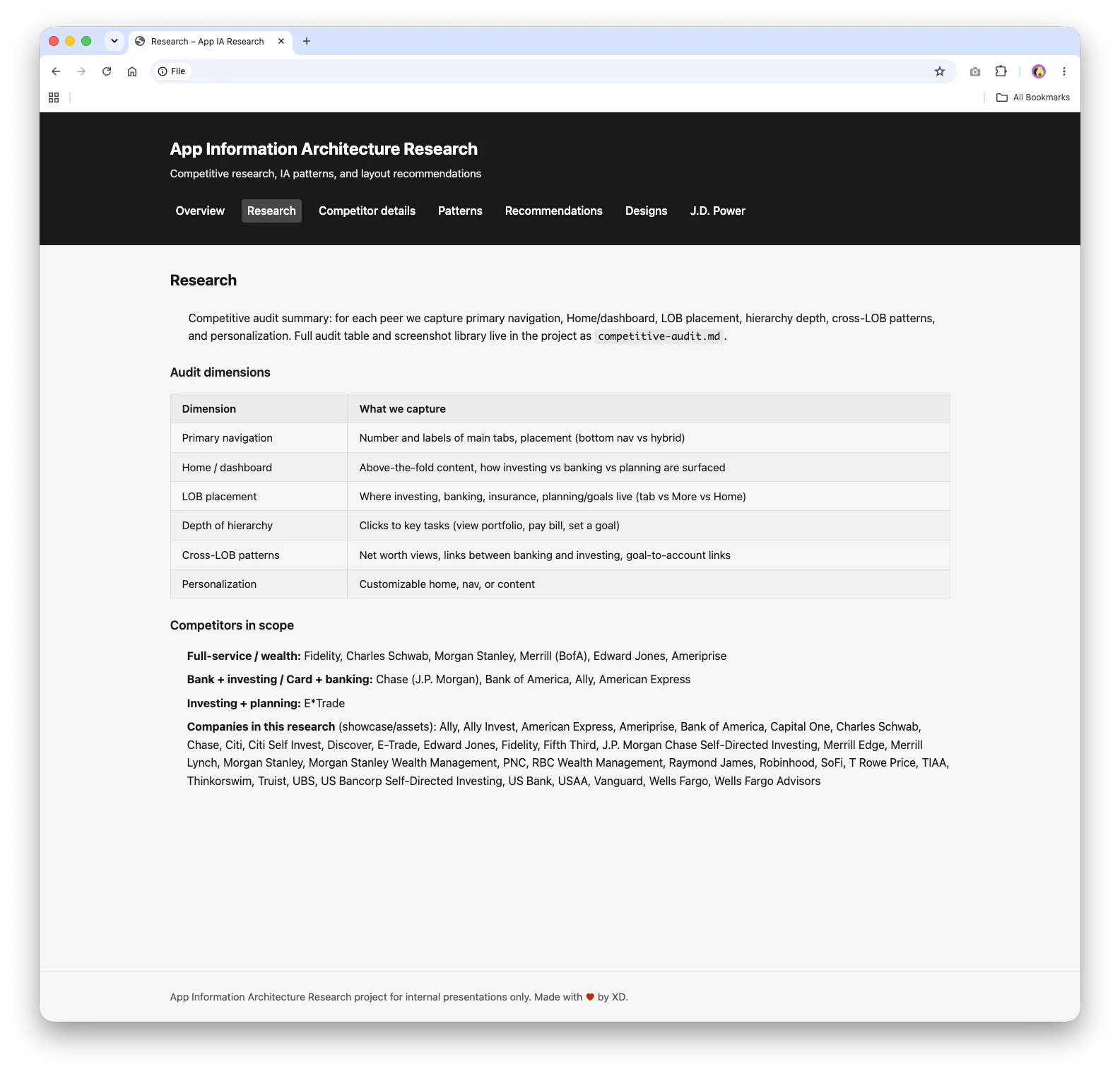
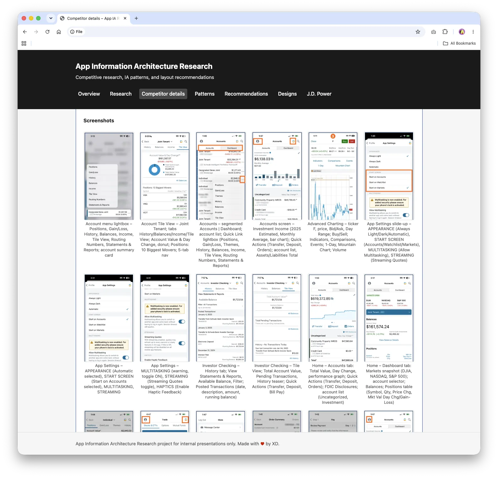
I drew on years of usability research and client feedback, plus a competitive information architecture (IA) study of 40+ financial apps and 700+ documented screens. The audit looked at navigation, dashboards, account structures, planning, service, and money movement across banking and wealth products.
2. Turn the vision into a clear structure
I mapped the stakeholder requirements against the research and developed a five-tab model that puts the plan first while keeping accounts and common actions close at hand.
3. Build something people can use
Instead of stopping at static screens, I used Cursor to build a self-contained, working prototype with real navigation, interactive charts, editable goals, account details, transfers, trading, check deposit, service flows, and guided help.
4. Iterate in the room
Frequent demos made feedback more specific. Stakeholders could try the idea, respond to real flows, and see how research changed the product, not just read about it in a report.
The defining design decision
The most important decision was to lead with the plan while keeping Accounts first-class.
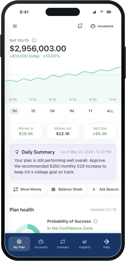
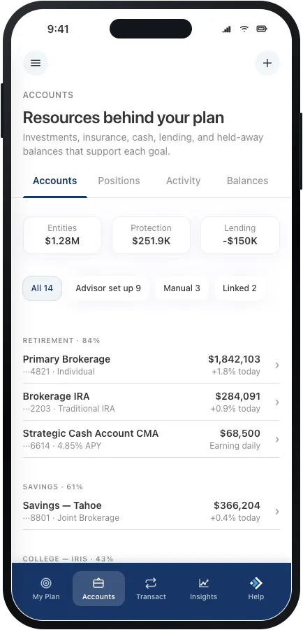
The original vision leaned toward making goals the only focus. I shared the research showing that balances were still one of the strongest reasons clients opened the app. That evidence led to a productive compromise: My Plan became the landing experience, and Accounts stayed a primary destination, one tap away.
The compromise also confirmed a recommendation from my earlier IA research, which had placed a Portfolio view in the second navigation slot. We simply renamed it Accounts to fit the plan-first framing.
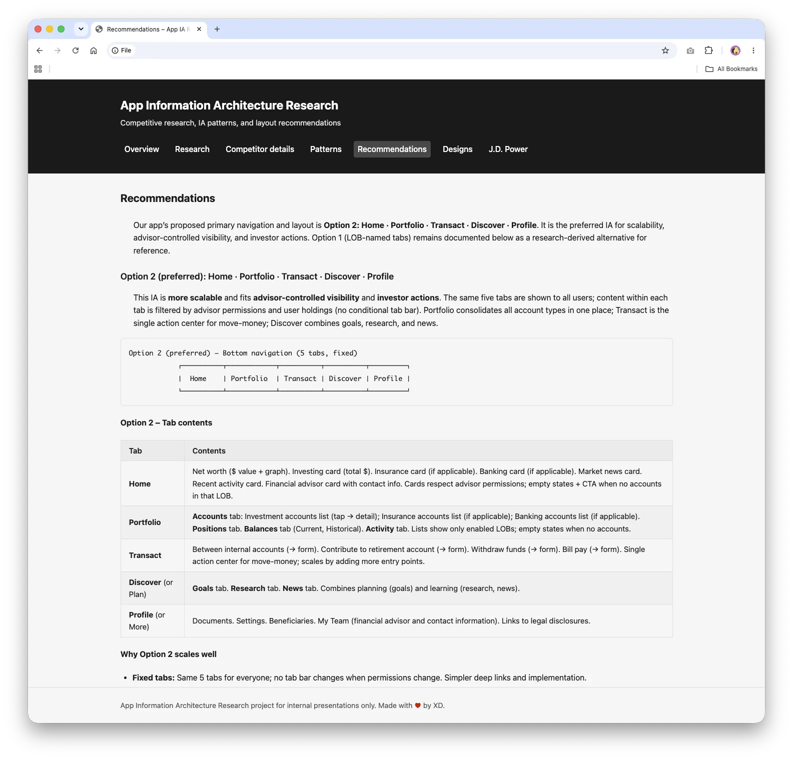
Five tabs
- My Plan brings together net worth, cash flow, plan health, goals, scenarios, and advisor context.
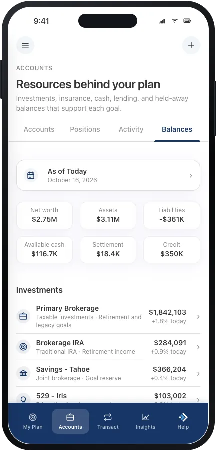
- Accounts shows the resources behind the plan across investments, banking, insurance, lending, and linked accounts.
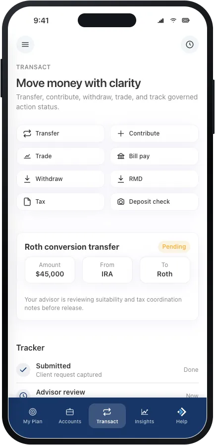
- Transact supports transfers, contributions, trading, bill pay, and mobile check deposit, with built-in guardrails.
- Insights offers plan-aware market context, portfolio information, and education.
- Help uses Beacon, an AI assistant, to answer questions, guide clients to the right screen, or connect them with a person.
The prototype
Horizon v2 became a broad, realistic product concept rather than a narrow happy path. It includes interactive plan health and goal details, a household balance sheet with current and historical views, and investment, banking, insurance, lending, and linked accounts. It also covers tax, fee, required minimum distribution (RMD), security, document, and onboarding experiences, all in light and dark modes.
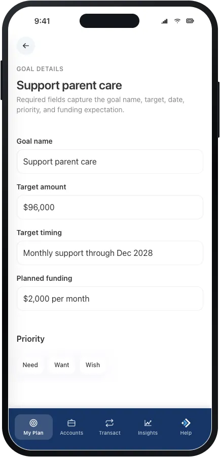
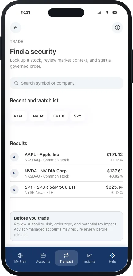
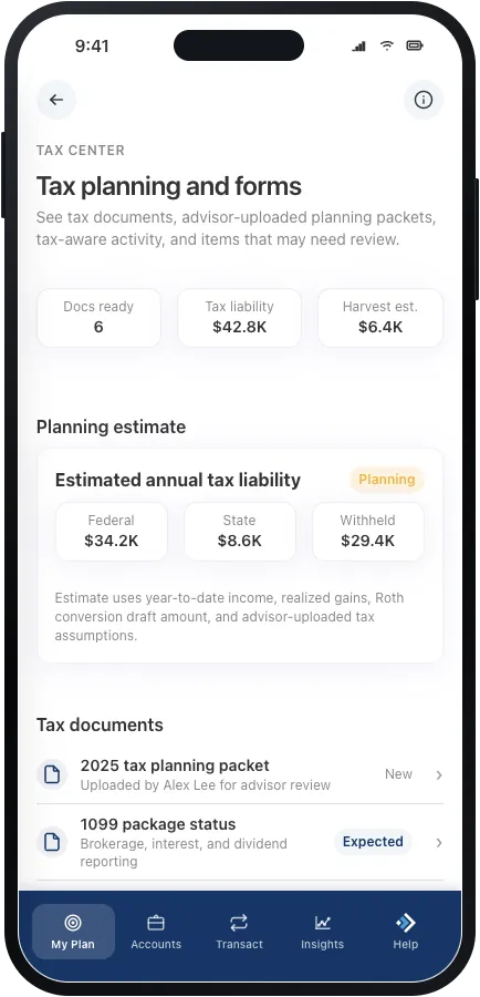
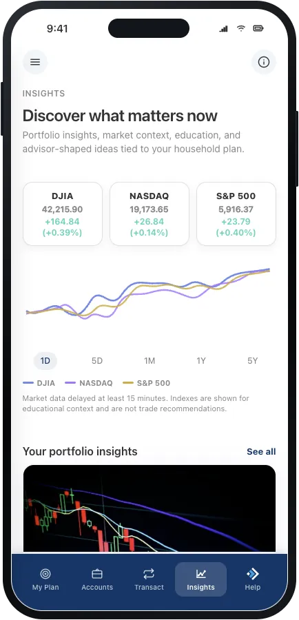
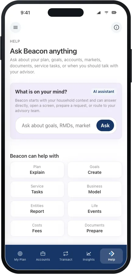
That depth mattered. It helped the team judge whether a plan-first model could still support the practical work clients need to get done.
Outcome
I presented Horizon v2 to the Business Strategy stakeholders, the design team, and design leadership, crediting my teammates’ work wherever it appeared. The prototype gave the organization a tangible way to compare two product directions and talk through the tradeoffs.
- The research-backed Accounts destination stayed in the product direction.
- The team produced two polished concepts covering 63 shared requirements.
- Horizon v2 is moving on to testing with advisors and investors.
The work is still early, so I don’t claim adoption or business-impact numbers yet. The primary prototype is moving through the investment process, while v2 is headed into testing. If funding moves forward, selected ideas from v2 may be folded into the primary direction.
Reflection
The most valuable thing I contributed wasn’t a single screen. It was bringing evidence into the conversation at the moment it could shape the product. A few principles I’m carrying forward:
- Research creates the most value when it shapes a live decision.
- A working prototype gets better feedback than a presentation alone.
- Speed and rigor can work together when a team builds on what it already knows.
- Clear ownership and generous collaboration make shared work stronger.
What’s next
- Design flows for clients who don’t have goals yet, or who have only one or two accounts.
- Test the concepts with financial advisors in moderated research.
- Test key flows with investors in unmoderated studies.
- After funding decisions, move the validated ideas into the primary prototype.
Explore the live work
These are the working prototypes and research sites from this project. Each one opens in a new tab.
